Google Maps adds new COVID-19 layer so you can track coronavirus trends
Many countries are in the process of rolling out "track and trace" mobile apps to make it easier for people to determine whether they have been in contact with anyone who has contracted coronavirus. Now Google has added a new layer to Google Maps that shows local information about COVID-19.
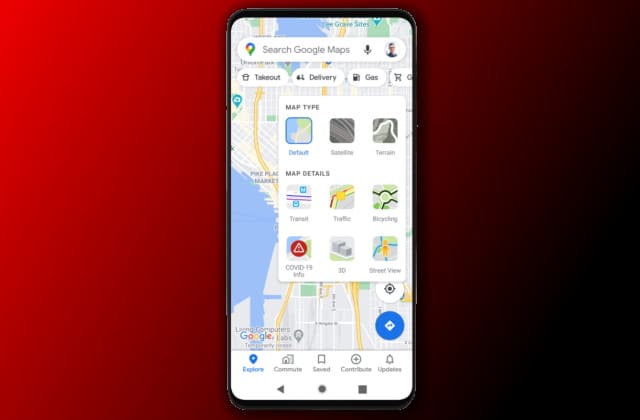
The optional layer shows a seven-day average of new COVID-19 cases for whatever area of the map you are looking at, and Google says that the aim of the new feature is to enable people to "make more informed decisions about where to go and what to do".
See also:
- Microsoft acknowledges that Windows 10 KB4568831 update is crashing Lenovo ThinkPads
- Microsoft releases Windows Terminal Preview 1.4 with important additions
- CISA issues emergency warning over critical Windows vulnerability
Drawing information from various sources including Wikipedia and the New York Times -- who in turn gather information from the likes of the Who Health Authority and government agencies-- the new COVID-19 layer shows at a glance whether cases are rising or falling in any given area. Simple color-coding makes it easy to tell whether a particular location is high or low risk.
Google explains:
When you open Google Maps, tap on the layers button on the top right hand corner of your screen and click on "COVID-19 info". You'll then see a seven-day average of new COVID cases per 100,000 people for the area of the map you’re looking at, and a label that indicates whether the cases are trending up or down.
The feature is in the process of rolling out to iOS and Android this week, and Google says that it will be available in every country and territory that Maps supports.