The origins of Mini date back to the early 1950s. The tiny vehicle got developed to fulfill a need in the British market for inexpensive, fuel-efficient compact automobiles. The Cooper Car Company and the British Motor Company, two giants in the British car industry, teamed up to create the first Mini. Depending on the model and branding, Mini has worn a variety of logos throughout the years, and the first Minis featured winged Morris and pentagonal Austin badges in 1959.
As mentioned, the modern Mini logo takes inspiration from the original Morris logo. Oxford and Birmingham were the first two locations to produce Mini vehicles. Morris Mini Minor was the name for the Oxford Mini, while the Austin Seven was the name for the other Mini. Each model was uniquely branded, with no two sharing any visual characteristics.
The Morris Mini logo was a circle with two arrows pointing out of it to the left and right, whereas the Austin Seven logo was a cursive-handwritten word mark with a coat of arms above it. Let's take a look at the Mini logo.
A New Logo And Brand Image For Mini
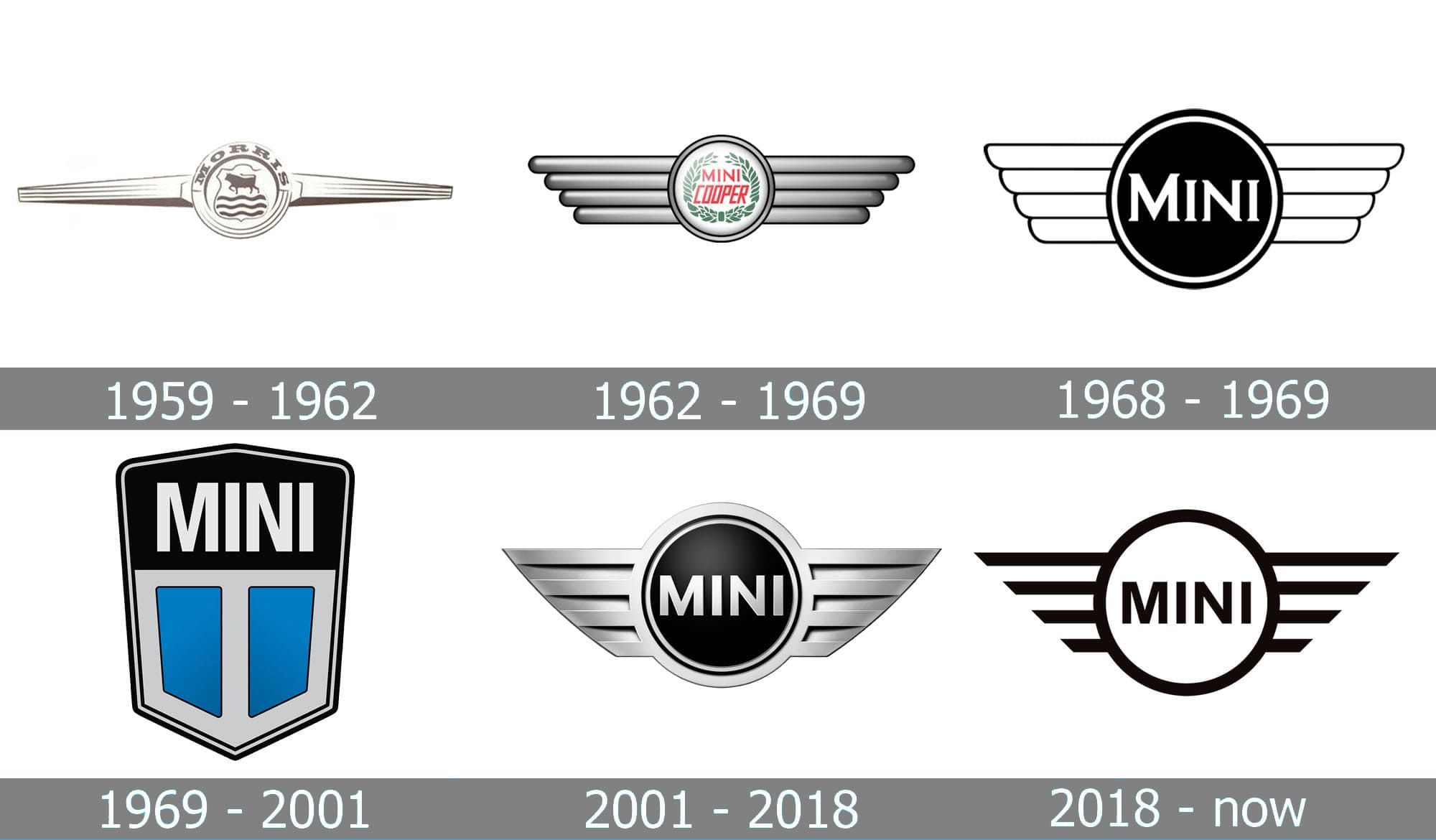
John Cooper, a newly recruited builder, designed the now-iconic Mini Cooper in 1961, and the company promptly rebranded itself to reflect the new direction. The logo introduced in 1962 had a silver circle with red “Mini Cooper” text within, flanked by two huge squared wings. A lot of ideas from that logo went into the present one. Since several companies first built vehicles under the Mini name, the early Minis had a fluid identity. It was only after BMW acquired Mini in 2000, that the iconic logo finally became permanent.
1968 saw the conception of a brand-new logo. The logo was now a black circle with a white outline. All letters were in capitals, with an emphasis on the initial “M.” The company's name was in a stylish font with strong bars and narrow, pointed serifs. In addition, the distinctive wings shrank and were now just black along the edges. It goes without saying that the 1968 version served as the basis for the current logo.
The Rover Group (Leyland Motors) bought the company in 1969 and introduced a revised logo, dividing the hexagonal 1969 logo in two. The top half featured a black backdrop and a strong white word mark, and the bottom half featured two turquoise portions separated by a thick white vertical line. The hexagon's complete silver surround heightened the already striking color contrast. The symmetry of the logo gave it a sophisticated, contemporary look, elevating it to the status of a powerful, memorable brand.
The Mini Logo From 2001 Has A Striking Resemblance To The Current One
Following BMW's purchase of Mini, the brand's storied eagle emblem got resurrected and given a contemporary makeover. In 2001, the Mini logo changed from a flat black circle with a silver outline to a three-dimensional form comprising a black circle with a silver outline sandwiched between two silver wings with hard edges. The word mark had a clean, confident sans-serif typeface. Overall, the logo's severe minimalism provided an air of sophistication and authority.
The 2018 redesign simplified the logo by flattening its formerly rounded shapes and making them a single color. In this way, the brand returned to a simpler, two-dimensional logo, with an emphasis on the strong, clean lines of the wings. Moreover, the number of automakers attempting to go from a 3D to a 2D car logo is a widespread trend in the industry today. Speaking of the wings, they stand for swiftness, strength, and freedom.
Now, let's discuss the typefaces used for the Mini logo. The “Mini” lettering was first rendered in a serif font that looked similar to Copperplate FS Bold Condensed. Later, a variation that was smoother and more consistent emerged (resembling Barnaul Grotesk Extra Bold/Motiva Sans Extra Bold fonts). The current font in use is a custom-made font named “MINI Serif.” Colors other than black and white are not used in any official company materials. Red, green, and a few other tones of gray were all part of the emblem in the past.
Mini is a little vehicle refined and improved upon for decades, and now it's among the best-selling models in the world. Currently, the brand name is all capitalized and depicted in a contemporary sans serif font. A ring surrounds it, and four lines, each of a different length, run horizontally on each side. You may have observed that the Mini logo went through a lengthy process of updating, but ultimately reverted to its original, simpler form.


